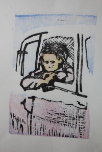
Assignment 4 Portraits: An empty pictogram without sound

Assignment 4 sketch
I’m now using my iPad to make sketches, more than paper, and I’m going to try to just upload some as videos.

Down the rabbit hole – sketchpad

My mother is in thrall to her calendar. It sits in front of her,  a chequered page, numbered, white, red and black. She refers to it at all times. It’s her lodestone, and on a good day, she writes in it. One or two words, a struggle. Often just “Got up.” But her day can take a different turn, something not calendared.

I felt that her experience could be likened to Alice’s. Surreal. Free-flowing. So I was following that train of thought here.

The fact that one can link everyday experience to a cultural phenomenon such as Alice in Wonderland is interesting: is Alice derived from our everyday experience, or is our everyday experience enriched by Alice? Either way, the shift from specific to general is noteworthy.

And the word was

Following on from the previous reflection, this sketch was exploring the relationship of my mother- distant in time and space- to my own lived experience, and finally acknowledging that I am exploring my mother’s situation as a metaphor for my own.
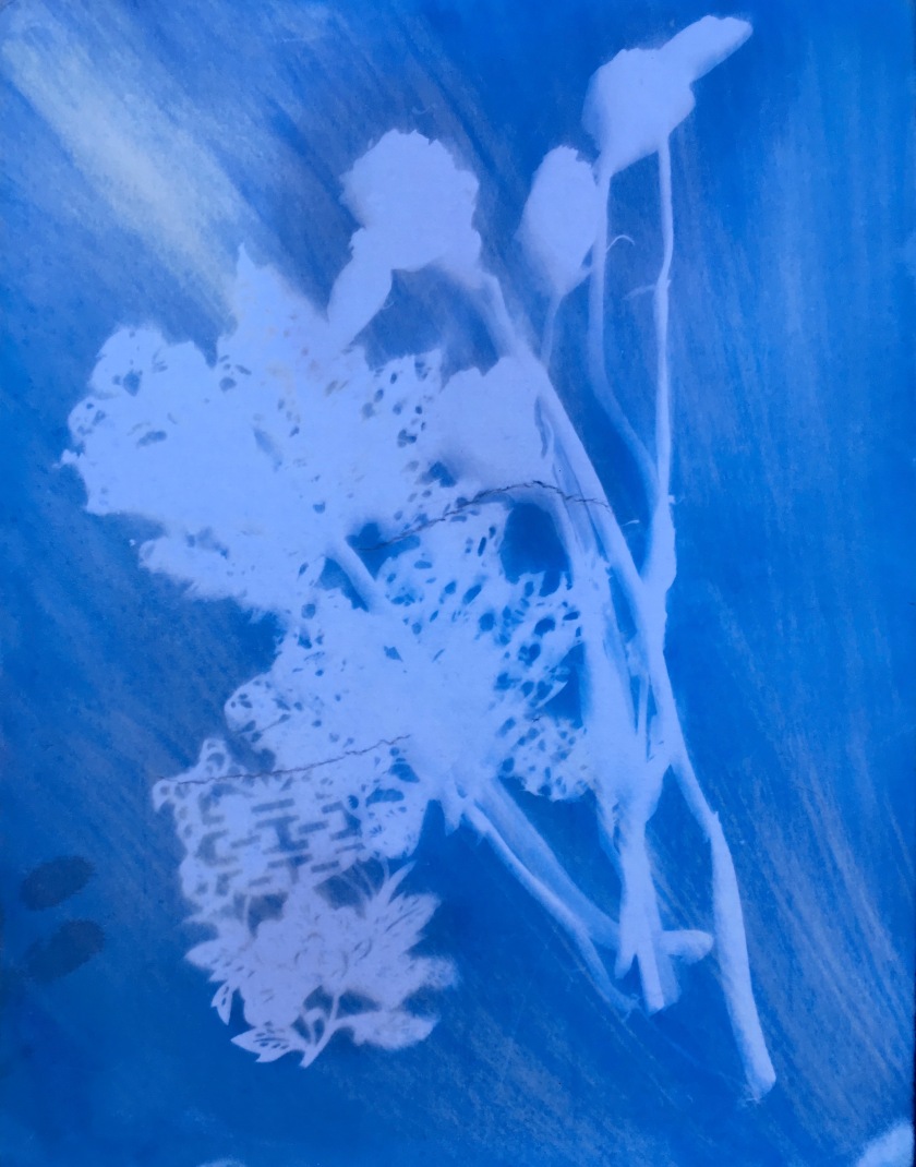
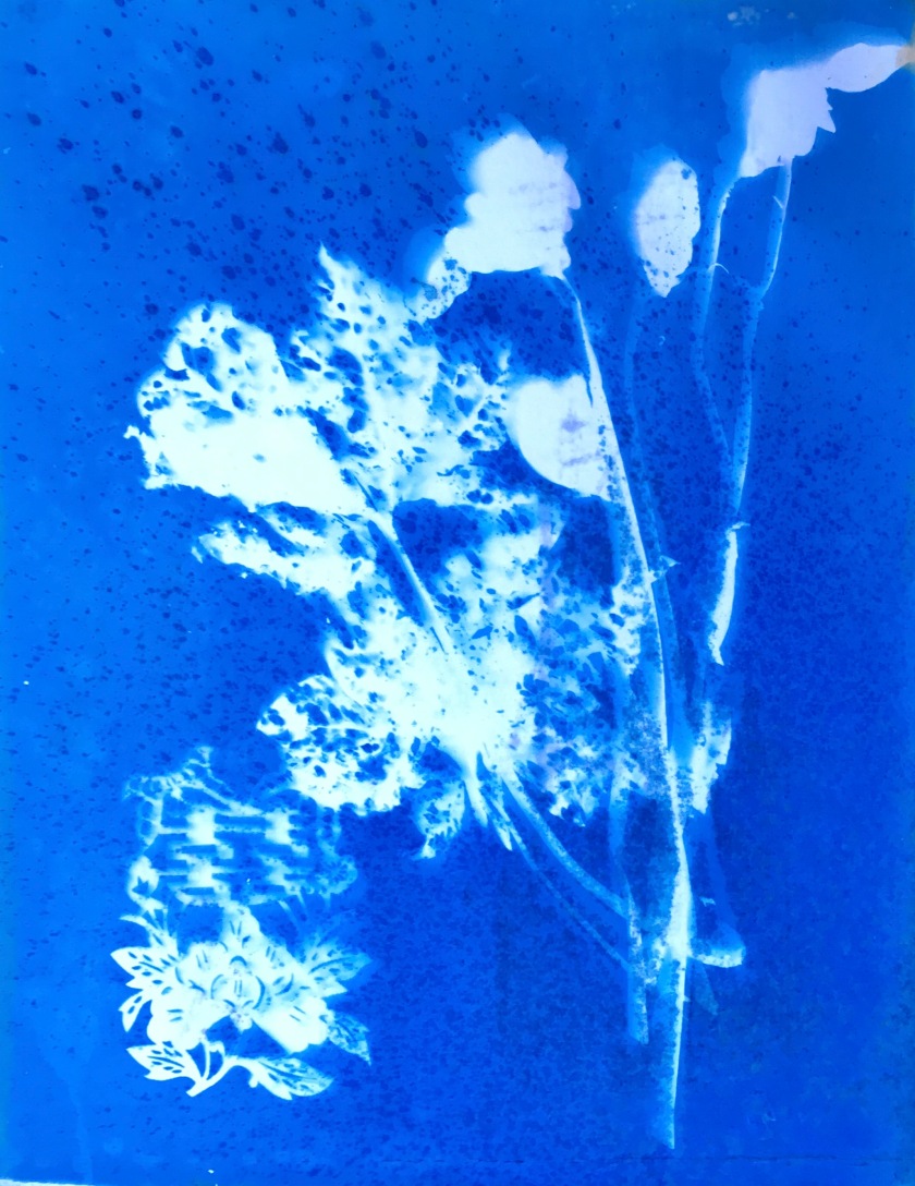
The work: Patchwork

This began with looking at pictures of my mother, and working with the ones that appealed to me. That’s a subjective judgement, but I decided to go with it, thinking that the reasons these images appealed would become clear later on.
The form of this piece is inspired by an evocative quote I read referring to Xu Bing’s Book from the Sky: “You are an empty pictogram without sound”, by the poet Bei Dao. It refers to the alphabet of 4000 pictograms, characters that look like Chinese characters but which cannot be read, that Xu Bing created for this installation. This piece is a set of related images of my mother that struggle to be read.

In this piece, the images are mostly highly comprehensible in the generic sense that they are all from a black and white photograph that depicts something recognisable. So in that sense, they are not “empty” pictograms. The context of their production is also able to be grasped, from clues about the setting, clothing, and historical and cultural knowledge. But in another sense they represent a visual language for which the code is lost.
The subject: A captured image- a stolen glance, one of those professional photographers who snapped people in the street without their permission then sold the images back. They are of a genre known as “walking photos”, and are mainly only of interest to the relatives of the people in the pictures, or as period pieces, giving information about historical setting, or fashion. Interesting phenomenon, rather hard to understand in the age of the selfie and the ubiquitous camera phone, but back then photos were relatively rare, and being snapped unaware when going about your day to day business quite an unusual thing. They are unusual because they are unposed, and capture a moment in the middle of a movement, usually walking down a street, with something else on your mind. In this one my mother is walking purposefully with a brown paper parcel in one hand. It’s just after the war I think, from the clothes.  And I can recognize the setting as Union Street in Aberdeen.

The images making up this piece are multiples, all versions of the same original photograph. The cyanotype technique is a second photographic technique here overlaid on the first, so that this is a second layer of captured image.

The repetition of images is a bit reminiscent of the kind of multiples Andy Warhol created of celebrities, where that endless multiplication was probably a large part of the point of them. These types of photos are of ordinary people, otherwise unnoticed except by their acquaintances. They are easily lost to posterity. Without being reclaimed by those with a relationship to them, they become random images, meaningless pictograms, forever silenced.

The reproduction of a seemingly moving figure in a series reminds me of Eadward Muybridge’s work on reducing movement to a series of still images. It can suggest an old black and white movie. But there is no movement in the figure, only on the part of the viewer. Assuming a left to right, top to bottom reading, there is fading towards the end. There are ghosts, negatives, walking amongst the rest.

Here, visually, I’m interested in the patterns set up by juxtaposition: the contrasts, sometimes subtle, sometimes more overt, of colour  (achieved by using different toners in development- vinegar, red wine, tea), clarity (different strengths of UV on different days/ times of day),  effects of distortion (folding cloth, distancing the negative from the substrate) and staining with water and toner. There is an effect of degradation, loss of focus, lack of definition, and some more dramatic effects of apparent splitting or cracking open of the image. These effects can be a paradigm for the lenses through which we view things. Overall there’s a sense of loss, of transience.

Then there is the progress of the images, left to right, top to bottom. That the image remains is a coincidence of materials and process. The action of light on silver coated film, and then again the action of light on photosensitive, now again, the action of light on chemically treated fabric. The image of a moment comes down to us through this coincidence of materials and light and the fact of capture at a specific point in time. The image remains, but it is a material thing, and it is not permanent, so it is also the remains of the image. The final row of images show their fragility.

The images can be repeated but they cannot be recreated. There is no possibility of knowing more, of knowing what was in front, or what behind, or zooming in for more detail. This is a flat representation only. The negative is a reminder of the process, that the camera was seeing a different coded image. The reversal of plates a reminder of the lack of truthfulness of these images. They are patch worked, stitched together. We often talk of the fabric of time, of something that can be ripped, that is at the same time a mere cover.

More personally, these images replay the conversations with my mother now, as I try to recreate her past through pictures, so that she can find herself, somewhere on that fabric. Sometimes, just occasionally, there is a spark of recognition, a moment when the monochrome experience flickers into colour. (I’m going to experiment with adding colour.)

The images rehearse her experience with the world now. There is repetition, but it’s  just a faint echo to her and she doesn’t notice. Her collection of the past is insecure. It could be this way or that, positive or negative, it might have been raining, it might have been sunny, who knows what was in the parcel,  we never will.
All we surmise is that at some time a woman walked down a street carrying a parcel: that woman is somehow linked to the person sitting in front of me but she might as well have walked out of the frame because the picture is all that remains. The memory is gone. If personality is composed of memory, it’s gone. If a portrait is a composite of experience, this is a two dimensional image in front of me now, one with no past.

But as the viewer I can’t cope with that. I can’t let her become an empty pictogram without sound.

So what I’m doing, emotionally, is preserving a part of the code of these images, making them continue to have meaning for a little longer.

25 images, Cyanotype on cloth, stitched

IMG_6535
A pictogram without sound, 25 images, cyanotype on cloth, stitched

Assignment 4 Portraits: woodcut 

Mokuhanga workshop

I used the image I’d been playing with in this workshop- the advice was to use something more abstract, but I was interested in exploring the image in a graphic ukiyo-e style with black outlines and primary colours, rather a cartoon effect, which would underline the constructed nature of images of self, but really it was just an exercise.  I was thinking of some of Gauguin’s roughly carved woodcuts and self portraits using thick black outlines.

The challenge in this workshop was to work with watercolour, and to create colour effects. I specifically tried to build up colour, using overlays of primary colours, rather like printed comic books, and to practice gradations of tone in a black and white image. The images involved making a key block – the black lines, with the registration mark  (kento)- then two colour blocks- more than one colour can be cut onto one block. I planned mine to get blue, red, orange and lilac by overlaying transparent watercolours.

It was also useful to learn about Japanese papers, and the role of sizing.

IMG_6581IMG_6582IMG_6583IMG_6584IMG_6585IMG_6586
The most inspiring thing of all was the way of working. The demonstration (the master printmaker is just that, not the artist and not the block cutter- just the person who makes the print) showed how she could sit crossed-legged with all her materials within arm’s reach, and produce extremely high quality, identical multi-layered images. It seemed a very zen-like practice: care, rehearsal, stillness, quality- and the images produced somehow exuded quiet.

I am reminded of Xu Bing’s repetitive carving of thousands of characters in wood, none of which could be read or pronounced.


Assignment 4 portraits- the image remains 

These are images made using photopolymer and copperplate etching techniques.

I wanted to use image and text, to make a statement about memory and the power of images.

This was a very frustrating exercise, as I was desperate to use photopolymer film, as a means of reproducing the photo I has decided to work with, but struggled to make it work. The text worked a bit better, but it was hard to get clear images using photopolymer alone, so I eventually etched using ferric chloride.

The slideshow is a record of trial and error:

This slideshow requires JavaScript.

Finally, I selected the most appropriate plate and text, a tw0-plate print in black and red oxide- both slightly unclear, which fits the meaning:

IMG_6608
Photopolymer print on paper, 20 X 16 cm

Good things about this image: the fading, though quite accidental, fits the mood and the sense of the text, and the purpose of the exercise, to capture rapidly disappearing memories of my mother, who is entering the shadows due to dementia. The image, now very flat, has become objectified, and is no longer a very personal image.  The person in the picture has become an everywoman, a generalised figure from the 1940s, and so more relatable to a wider audience than myself. The text itself is simple and thoughtprovoking, with a nice metaphorical sense. The font is classical- thinking of the typefaces used by Ian Hamilton Findlay- although that has issues in practice as the finer lines are often lost in the process.

Negatives; I feel the text is a bit “telling”, too direct, and I would next time choose something more elliptical.


Cyanotypes

This was a little bit of experimentation with creating different effects, using red wine to add subtle warm tones, washing soda to bleach- which also adds a yellowish tone on some materials, probably depending on sizing or something. Using a vinegar spray could add darker tone, and the amount of it controlled by using it before or during development. There’s a limit to the amount of control though, as the strength of UV comes into it, as well as the material used, how long the chemicals have been sitting, the chemicals themselves…

I like the last one best, but I like how all of them add some dynamism to the still life.

imageimageimage

Assignment 4: portraits

I want to approach this assignment first by considering what we mean by a “portrait”.

In the past, people referred to their portrait as their “likeness”. With the development of photography, the phrase “taking one’s likeness” was used, and in certain cultures was considered a theft of part of the person, as if the likeness had a separate existence, a doppelgänger, or as if the camera was penetrating the soul and stealing it. The criterion for successful portraiture was the extent to which it resembled the outward appearance of the subject, until abstraction, specifically Cubism, fractured the image and suggested multiple viewpoints, while Fauves used non-natural colour to express emotional truths.

Photography is now almost a plague, with “likenesses” of everyone and every action they do, and every meal they eat proliferating on social media. Image making is replacing words, and official photographed portraits seem frankly pointless. How can a single image replace the multiplicity of snaps that can sum up the wholeness of the person? When we see a posed studio photo we are all aware of the artifice, the sense of being manicured, and we treat it with a degree of skepticism, even without considering the digital manipulative tools that could have been used.

I want to explore photographic portraiture in this unit, but from the point of view of the image as sign, as a cipher that encodes a relationship between the viewed person, and the viewer/image maker, separate from the means of image making, the process variables involved in photography and printing.

I mainly focus on two images, both of my mother, taken in the middle of last century. These of course have personal significance, so the challenge is to give them more general meaning. These also allow me to continue the theme of earlier units, but continuing to address the subject of dementia and the loss of self.

These are the photos, edited a bit for contrast.

First a sketch, layers of deconstruction of an image of my grandmother. iPad Sketch Born in the 1880s, she lived over 90 years, and was a sum of various parts, a bit of image making, and a fair number of secrets and lies, and Victorian hypocrisy. She had a good brain, underused, which eventually gave out on her and betrayed her. Otherwise we’d never have seen beneath the surface. The photographed image is often seen as truthful: the camera doesn’t lie. But the camera has trained us to see with its single lens, just as much as it confirms to us what we think we see. This sketch simply explored the image as pattern, composition and sculptural form, an entity that takes up space. At the same time, the words are metaphors for the process of modelling, but consider the individual, the space and place they inhabit in the world, and their impact.


Research

Xu Bing and Contemporary Chinese Art: Cultural and Philosophical Reflections 

Ames, Roger T., Tsao Hsingyuan

2011

Bei Dao of Xu Bing’s characters in Book from the Sky and Square Word Calligraphy: “You are a nothing but a pictograph that has lost its sound.”

Historical context: pre-and post-1989, art operating inside, trying to influence a Chinese audience using western ideas, and post 1989, outside China, those who were of the avant-garde, and emigrating to US, responding to Western post-modern philosophy and welcomed by the West as signs of a “Chinese Spring”- who was their audience? Western/ external influences being brought to bear. (Art and many news outlets banned in PRC)

Cultural exile + exhibitions in western galleries.

Argument that Xu Bing has created a third cultural space.